
Evolution of Web Design Companies in Austin

The Evolution of Web Design Companies in Austin: Challenges, Trends, and Future Outlook In recent years, Austin, Texas, has emerged as a thriving hub for tech innovation and creativity. Among the various tech sectors flourishing in this vibrant city, web design companies play a pivotal role. From startups to established businesses, Austin’s web design firms are instrumental in shaping the digital landscape. This blog delves into the current state of web design companies in Austin, examining the challenges they face, trends they embrace, and their financial performance. The Current Landscape of Web Design Companies in Austin Booming Tech Ecosystem Austin’s tech ecosystem has seen exponential growth, fostering an environment where web design companies can thrive. The city has become a magnet for tech giants such as Apple, Google, and Facebook, which have established significant operations here. This influx of major tech players has created a robust demand for high-quality web design services, providing numerous opportunities for local firms. Diverse Clientele Web design firms in Austin cater to a diverse range of clients, from local businesses to international corporations. This diversity demands versatility and adaptability from these companies, pushing them to stay on the cutting edge of web design trends and technologies. The ability to serve various industries, including tech startups, healthcare, education, and retail, is a testament to the skill and creativity of Austin’s web design community. Innovation and Creativity Austin is renowned for its vibrant cultural scene and creative community, which significantly influences the web design industry. The city’s reputation as a hotbed of music, art, and innovation spills over into the tech sector, encouraging web designers to experiment with new ideas and approaches. This creative atmosphere helps web design companies in Austin produce unique and visually compelling websites that stand out in a crowded digital marketplace. Supportive Business Environment The local government and business organizations in Austin actively support the tech and startup ecosystem. Initiatives such as the Austin Technology Incubator and Capital Factory provide resources, mentorship, and networking opportunities for web design companies. This supportive environment helps new firms get off the ground and allows established companies to continue growing and innovating. Economic Growth and Stability Austin’s economy has shown remarkable resilience and growth, even during times of national economic uncertainty. The city’s low unemployment rate, combined with a steady influx of new residents and businesses, creates a favourable market for web design companies. The continued economic growth ensures a steady stream of clients seeking professional web design services. Collaborative Community Austin’s tech community is known for its collaborative spirit. Web design companies often participate in local meetups, conferences, and hackathons, fostering a sense of camaraderie and knowledge sharing. This collaborative environment encourages firms to stay updated on the latest industry trends and best practices, ultimately benefiting their clients. Access to Cutting-Edge Technology With its strong ties to the tech industry, Austin provides web design companies with access to the latest tools and technologies. Local firms often have early access to new software, frameworks, and hardware, allowing them to experiment and implement advanced solutions for their clients. This access to cutting-edge technology ensures that Austin’s web design companies remain competitive on a national and global scale. Proximity to Major Markets Austin’s strategic location in central Texas positions it within easy reach of other major markets, such as Dallas, Houston, and San Antonio. This proximity allows web design companies to expand their client base beyond Austin, tapping into additional opportunities and increasing their market reach. Challenges Faced by Web Design Companies in Austin Talent Acquisition and Retention Austin’s booming tech scene has created a highly competitive job market for skilled web designers, developers, and UX/UI experts. Web design companies in Austin often struggle to attract and retain top talent, as they must compete with not only other local firms but also large tech companies that offer lucrative salary packages and extensive benefits. To combat this, web design companies need to offer competitive compensation, opportunities for professional development, and a positive work environment that fosters creativity and job satisfaction. Keeping Up with Rapid Technological Changes The web design industry is characterised by rapid technological advancements. New tools, frameworks, and design trends emerge regularly, and web design companies must stay current to remain competitive. This constant evolution requires continuous learning and adaptation. Companies that fail to keep up risk delivering outdated and subpar services, leading to client dissatisfaction and potential loss of business. Investing in ongoing education and training for employees is essential to stay ahead in this fast-paced industry. Financial Instability Amidst Economic Fluctuations Economic fluctuations, such as those caused by the COVID-19 pandemic, can lead to financial instability for web design companies. During economic downturns, businesses often reduce their budgets for non-essential services, including web design and development. This can result in project cancellations, delays, and reduced revenue for web design firms. Diversifying service offerings and building a robust client base across various industries can help mitigate these risks. Managing Client Expectations Another challenge faced by web design companies is managing client expectations. Clients often have high expectations and may not fully understand the complexities and time required for web design projects. This can lead to unrealistic deadlines and demands. Effective communication and setting clear, achievable goals from the outset are crucial in managing expectations and ensuring client satisfaction. Trends Shaping the Future of Web Design in Austin Emphasis on User Experience (UX) Modern web design increasingly focuses on user experience (UX). Companies are investing in UX research and design to create websites that are intuitive, accessible, and engaging. This trend reflects a broader movement towards user-centred design in the tech industry. By prioritising UX, web design firms in Austin can enhance user satisfaction and drive better business outcomes for their clients. Integration of AI and Machine Learning Artificial intelligence (AI) and machine learning (ML) are making significant inroads into web design. These technologies enable web design companies to automate various aspects of the design process, such as generating design elements, optimizing website performance, and providing personalized
6 Simple Steps to Transform PSD to Shopify Store
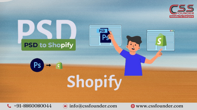
If you’re a designer, developer, or entrepreneur looking to launch an online store, converting your Photoshop (PSD) design to a functional Shopify website can seem like a daunting task. However, with the right approach and tools, the process can be streamlined and efficient. In this article, we’ll guide you through six simple steps to transform your PSD design into a stunning and fully-functional Shopify store. Step 1: Prepare Your PSD Design Before you begin the conversion process, it’s essential to ensure that your PSD design is optimized and ready for development. Here are a few key considerations: Organize your layers: A well-structured PSD file with properly named and grouped layers will make it easier to translate your design into code. Define responsive breakpoints: Shopify is a responsive platform, so you’ll need to design for multiple screen sizes. Identify the breakpoints you’ll need and create separate artboards or slices for each viewport. Export assets: Export all necessary images, icons, and graphical elements from your PSD file in the appropriate formats (e.g., PNG, SVG) for web use. Step 2: Set Up Your Shopify Store Next, you’ll need to create a Shopify account and set up your online store. This process is quite simple to follow and can be done in a few simple steps: Go to the Shopify website and sign up for a 14-day free trial. Choose a suitable theme for your store that aligns with your design aesthetic. Customize the theme settings, such as colors, fonts, and layout, to match your PSD design as closely as possible. Step 3: Install Required Apps and Plugins Shopify offers a vast ecosystem of apps and plugins that can enhance the functionality and visual appeal of your store. Depending on your specific requirements, you may need to install additional apps or plugins. Some popular options include: Page builders: For advanced customization and drag-and-drop editing (e.g., Shogun, GemPages). Product customizers: For allowing customers to personalize products (e.g., Product Customizer, Intuitive). Checkout optimizers: For streamlining the checkout process (e.g., Checkout Boost, One-Click Upsell). Step 4: Customize Your Theme With your Shopify store set up and the necessary apps installed, it’s time to start customizing your theme to match your PSD design. This step typically involves modifying the theme’s HTML, CSS, and Liquid (Shopify’s templating language) files. If you’re comfortable with web development, you can edit the theme files directly. However, if you’re not a developer, consider using a visual page builder or hiring a Shopify expert to handle the customization for you. Step 5: Add Products and Content Once your theme is customized to match your PSD design, it’s time to populate your store with products and content. This step involves: Adding product descriptions, images, and pricing information. Creating collections and organizing your products into logical categories. Writing engaging copy for your homepage, about page, and other content sections. Optimizing your store for search engines (SEO) by adding meta tags, alt text, and other relevant data. Step 6: Test and Launch Before launching your Shopify store, it’s crucial to thoroughly test every aspect of your site to ensure a seamless user experience. Some key areas to work upon: Cross-browser and cross-device testing: Ensure your store looks and functions correctly across different browsers and devices (desktop, tablet, mobile). Performance testing: Check for slow-loading pages, broken links, or other performance issues that could negatively impact the user experience. Usability testing: Have friends, family, or potential customers navigate through your store and provide feedback on the overall experience. Once you’ve addressed any issues identified during testing, it’s time to launch your Shopify store and start promoting it to your target audience. Conclusion Converting a PSD design to a fully-functional Shopify store may seem like a complex task, but by following these six simple steps, you can streamline the process and achieve a professional-looking online store that accurately reflects your design vision. Remember, the key to success is thorough preparation, attention to detail, and a willingness to seek expert help when needed. With the right approach, your Shopify store can be a powerful e-commerce platform that drives sales and enhances your brand’s online presence.
Mastering Mobile Website Design: Top 10 Tips You Need to Know
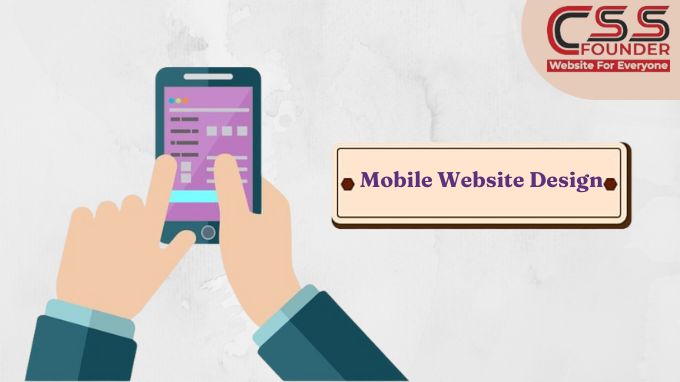
In the ever-evolving digital landscape, mobile devices have become the primary means of accessing the internet for countless users worldwide. As a result, creating a mobile-friendly website is no longer an option – it’s an absolute necessity. A well-designed mobile website can significantly enhance user experience, increase engagement, and ultimately drive business growth. In this article, we’ll explore 10 essential tips to master mobile website design Embrace Responsive Design Responsive design is the cornerstone of mobile-friendly websites. It ensures that your website automatically adjusts its layout, content, and functionality to provide an optimal viewing experience across various devices and screen sizes. By implementing responsive design, you eliminate the need for separate mobile and desktop versions, streamlining maintenance and ensuring consistency across platforms. Prioritize User Experience When designing for mobile, user experience should be your top priority. Mobile users typically have shorter attention spans and are often on-the-go, making it crucial to provide a seamless and intuitive experience. Simplify navigation, minimize clutter, and make essential information and actions easily accessible with a few taps or swipes. Optimize for Speed Slow-loading websites are a major deterrent for mobile users, often leading to high bounce rates and lost opportunities. Optimize your website’s speed by compressing images, minifying code, leveraging browser caching, and implementing lazy loading techniques. Additionally, consider using accelerated mobile pages (AMP) or progressive web apps (PWAs) to deliver lightning-fast experiences. Enhance Readability Small screens and varying viewing conditions can make it challenging to read content on mobile devices. Improve readability by using a legible font size, increasing line spacing, and ensuring sufficient contrast between text and background colors. Break up lengthy blocks of text into shorter, more digestible sections, and leverage headings and subheadings to aid content scanning. Simplify Forms Filling out forms on mobile devices can be a frustrating experience due to smaller screen sizes and limited input methods. Streamline the form-filling process by reducing the number of required fields, using appropriate input types (such as number pads for numeric inputs), and providing clear labels and instructions. Consider implementing auto-fill or auto-advance features to further enhance the user experience. Leverage Mobile Gestures Mobile users are accustomed to interacting with content through touch gestures, such as tapping, swiping, and pinching. Design your website with touch-friendly elements, ensuring that interactive components are large enough for easy tapping and that navigation menus and content sections respond seamlessly to swipe gestures. Optimize for Thumbs Most mobile users hold their devices with one hand and interact with the screen using their thumbs. Position primary navigation and interactive elements within the “thumb zone” – the area easily accessible by the user’s thumb – to promote comfortable and effortless interaction. Incorporate Mobile Features Take advantage of mobile-specific features to enhance the user experience. Integrate click-to-call functionality for phone numbers, provide access to the user’s current location for location-based services, and leverage camera and microphone access for seamless multimedia integration. Implement Responsive Images and Media Ensure that images, videos, and other multimedia content on your website adapt seamlessly to different screen sizes and resolutions. Use responsive techniques, such as fluid layouts and scalable vector graphics (SVGs), to maintain visual quality and prevent distortion or excessive data usage. Test, Test, and Test Again Testing is crucial to ensuring a flawless mobile experience. Use a variety of mobile devices and emulators to test your website across different screen sizes, operating systems, and browsers. Additionally, conduct usability testing with real users to identify potential issues, gather feedback, and continuously refine your design. By implementing these 10 tips, you’ll be well on your way to creating a mobile website that not only looks great but also provides an exceptional user experience. Remember, in the mobile-centric world we live in, a well-designed mobile website can be a powerful competitive advantage, driving increased engagement, conversions, and overall business success.
Unleash Your E-Commerce Potential: Mastering Shopify Website Best Practices

Launching an ecommerce business on Shopify? Setting up your online store the right way from the start is crucial for success. Shopify makes it easy to get an attractive, functional website up and running quickly. However, there are some key best practices you’ll want to follow during the setup process to ensure your store looks professional, provides a great user experience, and sets you up to effectively market your products. Here are some top practices to master shopify website Choose the Right Theme Your theme essentially acts as the template for your entire website, controlling everything from the layout and navigation menus to fonts and product galleries. With so many free and paid Shopify themes available, it’s important to select one that fits your brand aesthetic and product types. Choose a clean, modern, mobile-friendly theme that is easy for customers to navigate. Make sure it has the functionality you need like zoom capabilities for product images, quick view options, and video integration if selling products that require demos. You can always further customize the theme’s code later, but start with one that matches your basic requirements. Streamline Navigation and Structure How you organize your website’s navigation and structure impacts search engine optimization and the user experience. Group related products into sensible collections and categories. Utilize multi-level navigation menus and filters so customers can easily find what they’re looking for without getting overwhelmed. Create an FAQ or help section, “About Us” page, and prominent contact information so visitors feel supported. Keep your navigation simple and use descriptive page titles – the goal is to allow customers to quickly locate products and information. Optimize Product Pages Since these are the core pages that drive sales, spend extra time perfecting your product detail pages. Use high-quality visuals from multiple angles, along with videos, 3D models, and other interactive media when applicable. Write unique, detailed product descriptions focused on benefits and use cases rather than just specs. Incorporate trust signals like customer reviews. Make the add-to-cart process smooth and simple. Tell Your Brand Story An “About Us” or “Our Story” page is a must for connecting with potential customers on a deeper level. Share your brand purpose, mission, and what makes your products unique. Give customers a behind-the-scenes look at your team, operations, and brand values through photos and videos. Introducing the real people and inspiration behind your business helps build trust and brand loyalty. Implement SEO Best Practices Getting found by new customers through search is crucial, so optimize your website from the start. Conduct keyword research and incorporate relevant search terms into page titles, URLs, headers, alt text, and product descriptions in a natural way. Create unique meta descriptions for each page. Structure URLs logically based on your product categories. Set up Google Search Console and submit an XML sitemap to Google. Enable breadcrumb navigation and create an HTML sitemap for users. These on-site SEO efforts ensure search engines can effectively crawl, understand, and index your site. Connect Key Sales Channels Using Shopify’s multi-channel sales capabilities allows you to reach customers in more places. For example, you can easily create shoppable Instagram posts through Shopify while keeping inventory synced across sales platforms. It’s also simple to launch a Facebook Store that connects with your Shopify website and integrates with Facebook ads for retargeting. Streamline operations by consolidating your online and in-person sales through Shopify point-of-sale as well. Build Customer Relationships Use Shopify apps and tools to foster lasting customer relationships through loyalty programs, automated abandoned cart emails, personalized product recommendations, and more. For instance, offering a discount code for signing up for your email newsletter helps grow your subscriber list. Setting up retargeting ads through Shopify’s integration with Facebook and Google Ads platforms ensures you can re-engage visitors who don’t purchase right away. Little touches like these increase conversions and lifetime customer value. Ensure Mobile Optimization With over half of online shopping now occurring through mobile devices, your Shopify website absolutely must be mobile-optimized and easy to navigate on smaller screens. Choose a responsive theme and test it out across various mobile devices during setup. Keep mobile navigation streamlined and design with a “thumb-friendly” approach that minimizes scrolling and clicking. Ensure product images, videos, and descriptions are optimized for mobile. By following these best practices as you build out your Shopify store, you’ll create an ecommerce website that is user-friendly, SEO-optimized, and designed to turn interested shoppers into loyal customers. Investing time upfront for a polished, strategic setup lays the foundation for long-term online sales success.
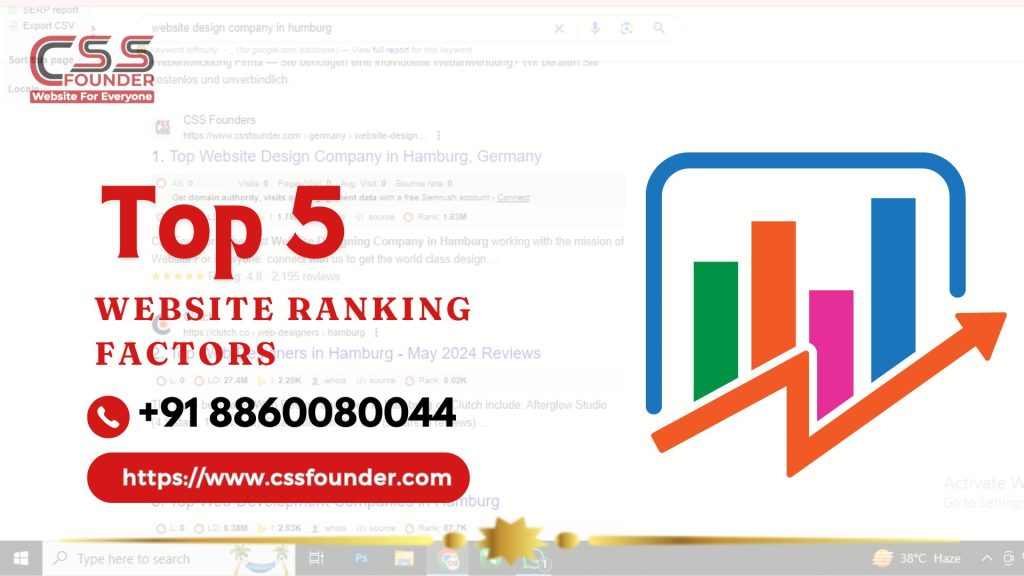
Top 5 Website Ranking Factors That Can Take Your Business Productivity to Its Peak
In the digital age, a strong online presence is crucial for business success. At CSS Founder, we understand the importance of a strong online presence for your business success. Your website is often the first interaction potential customers have with your brand, making its performance and visibility crucial. To ensure your business reaches its peak productivity, it’s essential to focus on key website ranking factors that influence search engine optimization (SEO) and user experience. Here are the top 5 website ranking factors that can propel your business to new heights. Top Ranking Factor for any website A- Website UI & UX At CSS Founder, we understand that a well-designed website is crucial for both user satisfaction and search engine optimization (SEO). User Interface (UI) and User Experience (UX) play significant roles in determining your website’s ranking on search engines like Google. Here’s how: 1. Improved User Engagement A well-crafted UI and seamless UX keep visitors engaged with your website. Easy navigation, intuitive design, and visually appealing elements encourage users to spend more time on your site, explore multiple pages, and interact with your content. Search engines interpret longer visit durations and lower bounce rates as indicators of valuable content, which can improve your ranking. 2. Mobile-Friendliness With the increasing use of mobile devices, a responsive design is essential. A mobile-friendly UI ensures your website looks and functions well on all screen sizes, providing a consistent experience across devices. Google uses mobile-first indexing, meaning it predominantly uses the mobile version of your content for indexing and ranking. A superior mobile UX can thus directly impact your search engine rankings. 3. Faster Load Times Page speed is a crucial ranking factor. A well-optimized UI and UX can significantly reduce load times by minimizing the use of heavy images, leveraging browser caching, and optimizing code. Faster load times enhance user experience, reduce bounce rates, and signal to search engines that your site is efficient and user-friendly, leading to higher rankings. B- Content Quality & Accuracy At CSS Founder, a website designing company in Sydney, we recognize that in the realm of digital marketing, content quality and accuracy are paramount for achieving high website rankings. Here’s how these critical factors play a role in enhancing your site’s visibility and overall performance on search engines. 1. Enhanced User Engagement High-quality and accurate content is designed to meet the needs and interests of your audience. When users find your content valuable, they are more likely to spend time on your site, explore multiple pages, and return for more information. This increased engagement signals to search engines that your website is providing a positive user experience, which can improve your rankings. 2. Building Trust and Credibility Accurate and well-researched content establishes your website as a trustworthy source of information. When users trust your content, they are more likely to share it, link to it, and reference it in their own work. This not only broadens your reach but also earns high-quality backlinks, which are a significant ranking factor in search engine algorithms. 3. Reduced Bounce Rates When your content is high-quality and accurate, visitors are less likely to leave your site immediately after arriving. This reduces your bounce rate, which is a metric that search engines use to assess the relevance and quality of your site. Lower bounce rates are associated with higher rankings because they indicate that users are finding what they need on your site. 4. Improved SEO Quality content is optimized with relevant keywords, but it also goes beyond keyword stuffing. It provides comprehensive answers to users’ queries, incorporates natural language, and includes semantic keywords that enhance the depth and breadth of the information provided. Accurate content that addresses user intent can help your site rank for a broader range of search terms. C- On Page Optimisation At CSS Founder, we emphasize the critical role of on-page optimization in achieving top website rankings. On-page optimization involves refining various elements within your website to make it more search engine friendly and enhance user experience. Here’s how on-page optimization is responsible for improving your website’s ranking: 1. Keyword Optimization Keywords are the foundation of SEO. By strategically placing relevant keywords in your website’s content, titles, meta descriptions, headers, and URLs, you signal to search engines what your site is about. Proper keyword optimization helps search engines understand the context of your content, making it easier for your site to appear in relevant search results. 2. Meta Tags Meta tags, including title tags and meta descriptions, play a significant role in on-page optimization. Title tags provide a concise description of the page’s content and are crucial for both search engines and users. A well-crafted title tag with the right keywords can improve your click-through rate (CTR) and search engine ranking. Meta descriptions, though not a direct ranking factor, influence user behavior by providing a summary of the page, encouraging users to click through to your site. 3. Content Quality and Structure High-quality, informative, and engaging content is essential for on-page optimization. Content should be well-structured with clear headings, subheadings, and bullet points to make it easy for users to read and for search engines to crawl. Using internal linking within your content helps search engines discover more of your pages and understand the structure of your site, which can positively impact your ranking. 4. URL Structure Clean and descriptive URLs enhance both user experience and search engine crawling. URLs should be short, include relevant keywords, and be easy to read. Proper URL structure helps search engines understand the hierarchy and content of your site, which can improve indexing and ranking. 5. Image Optimization Images make your content more engaging, but they also need to be optimized. Using descriptive file names and alt text with relevant keywords helps search engines index your images properly. Additionally, optimizing image file sizes ensures faster page loading times, which is a crucial ranking factor. D- Page Speed Insights Google PageSpeed Insights is a powerful tool that evaluates the performance of your
The Latest Web Design Trends in 2024

In the rapidly evolving world of web design, staying current with the latest trends is crucial for creating engaging, user-friendly, and aesthetically pleasing websites. As we move through 2024, several design trends are shaping the digital landscape. These trends not only enhance the visual appeal of websites but also improve usability and accessibility. Let’s dive into some of the most prominent web design trends of this year, which are essential for any web design company aiming to stay ahead of the curve.. 1. Minimalist Design Minimalist design continues to dominate the web design space in 2024. Characterised by simplicity and functionality, minimalism focuses on using fewer elements to create a clean, uncluttered look. This approach not only enhances the visual appeal but also improves the user experience by reducing distractions and making navigation straightforward. Key features of minimalist design include: Ample White Space: Generous use of white space helps to highlight content and create a balanced layout. Simple Colour Palettes: Minimalist designs often use a limited colour palette, typically neutral tones, to maintain a clean look. Clean Typography: Simple, sans-serif fonts are preferred for their readability and modern appearance. Essential Elements Only: Only necessary elements are included, ensuring that every component has a clear purpose. 2. Dark Mode Dark mode has become a staple in modern web design, offering an alternative to traditional light interfaces. This trend gained popularity due to its aesthetic appeal and practical benefits, such as reducing eye strain in low-light environments and saving battery life on OLED screens. Key characteristics of dark mode include: Dark Backgrounds: Typically, dark mode uses black or dark gray backgrounds with lighter text. High Contrast: Ensuring text and other elements stand out against the dark background is crucial for readability. Vibrant Accents: Bright accent colours can be used to highlight important buttons and links, creating a striking visual contrast. User Preference: Many websites now offer a toggle switch, allowing users to choose between dark and light modes based on their preference. 3. Responsive Design With the increasing variety of devices used to access the web, responsive design remains essential. A responsive design ensures that websites look and function well on all screen sizes, from smartphones to desktops. Key aspects of responsive design include: Fluid Grids: Using a grid system that scales based on the screen size ensures that the layout adapts seamlessly. Flexible Images: Images and media adjust their size and resolution based on the device, ensuring fast loading times and optimal display. Media Queries: CSS media queries are used to apply different styles depending on the device characteristics, such as screen width and orientation. Mobile-First Approach: Designing for mobile devices first and then scaling up for larger screens ensures a better user experience across all devices. 4. 3D Elements and Illustrations 3D elements and illustrations are becoming increasingly popular in web design. They add depth and realism to websites, making them more engaging and interactive. Advances in technology have made it easier to incorporate 3D graphics without compromising loading times or performance. Key features of 3D elements and illustrations include: Interactive 3D Models: Allowing users to interact with 3D objects can enhance engagement and provide a unique user experience. Detailed Illustrations: High-quality 3D illustrations can make a website stand out and convey complex ideas more effectively. Augmented Reality (AR) Integration: Some websites are starting to integrate AR to provide immersive experiences, particularly in e-commerce and product showcases. 5. Micro-Interactions Micro-interactions are small animations or design elements that provide feedback to users. They play a crucial role in enhancing the user experience by making interactions feel more intuitive and responsive. Examples of micro-interactions include: Hover Effects: Changing the appearance of buttons or links when hovered over. Loading Animations: Providing visual feedback while content is loading. Interactive Form Fields: Highlighting form fields or showing validation messages in real-time. Notification Badges: Indicating new messages or updates with subtle animations. 6. Voice User Interface (VUI) With the rise of smart speakers and voice assistants, voice user interfaces (VUI) are becoming an important aspect of web design. Incorporating voice search and commands can enhance accessibility and provide a hands-free browsing experience. Key aspects of VUI include: Voice Search Optimization: Ensuring that websites are optimized for voice search queries. Voice Commands: Allowing users to navigate the website or perform actions using voice commands. Audio Feedback: Providing auditory feedback to confirm actions or notify users. 7. Customizable User Experiences Personalization is key in 2024, with more websites offering customizable user experiences. This trend involves tailoring content and features to individual users based on their preferences, behavior, and demographics. Key features of customizable user experiences include: User Profiles: Allowing users to create profiles and save their preferences. Dynamic Content: Displaying content that adapts to the user’s interests and past interactions. AI and Machine Learning: Using AI to predict user needs and personalize the experience in real-time. Localization: Adapting content and design based on the user’s geographic location. 8. Bold Typography Bold typography is making a statement in web design, with designers using large, attention-grabbing fonts to create a strong visual impact. This trend is particularly effective for headlines and calls to action, making it easier to convey important messages. Key features of bold typography include: Oversized Fonts: Using larger-than-usual fonts for headlines and key text elements. Contrasting Text: Ensuring that bold text contrasts sharply with the background for readability. Unique Fonts: Choosing distinctive fonts that reflect the brand’s personality and stand out visually. Minimal Text: Pairing bold typography with minimal text to keep the design clean and focused. 9. Immersive Storytelling Immersive storytelling is a trend that combines visual design, interactive elements, and compelling narratives to create engaging user experiences. This approach is particularly effective for brands looking to build emotional connections with their audience. Key features of immersive storytelling include: Visual Narratives: Using images, videos, and animations to tell a story. Interactive Elements: Incorporating elements like scroll-triggered animations and clickable hotspots to engage users. Sequential Content: Presenting content in a logical, story-like sequence that guides users
Unlock the Power of Digital Presence: 10 Perks of Having a Business Website
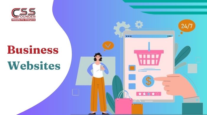
In the era of digital transformation, having a strong online presence is no longer a luxury but an imperative for businesses of all sizes and industries. A well-designed, user-friendly website acts as a virtual storefront, a marketing powerhouse, and a hub for customer engagement. Here are ten compelling reasons why you need a business website to reach your customers. Global Reach and 24/7 Accessibility With a website, your business can transcend geographical boundaries and reach a global audience around the clock. Unlike a physical storefront, your online presence is accessible to potential customers from anywhere in the world, at any time of day or night. This increased visibility and accessibility open up new markets and opportunities for growth. Cost-Effective Marketing and Advertising Traditional marketing methods, such as print ads and direct mail campaigns, can be costly and have a limited reach. A well-optimized website, on the other hand, provides a cost-effective way to market your business on a global scale. By leveraging search engine optimization (SEO) and online advertising platforms, you can target your desired audience with precision and measurable results. Credibility and Professional Image In today’s digital age, consumers often judge a business’s credibility and professionalism based on its online presence. A well-designed, informative website conveys a sense of legitimacy and trustworthiness, setting your business apart from competitors who lack an online presence or have an outdated website. Showcase Products and Services A website serves as a dynamic, multimedia showcase for your products and services. With high-quality images, videos, virtual tours, and detailed descriptions, you can provide potential customers with a comprehensive understanding of your offerings, enhancing their decision-making process and increasing the likelihood of making a sale. Improved Customer Service and Support By incorporating features such as online ordering, frequently asked questions (FAQs), knowledge bases, and contact forms, a website can streamline customer service and support. Customers can easily find the information they need, place orders, or submit inquiries, reducing the burden on your staff and improving overall efficiency. Gather Valuable Customer Data and Insights A website can be a goldmine of customer data and analytics, providing insights into visitor behavior, preferences, and demographics. This information can inform your marketing strategies, product development, and overall business decisions, giving you a competitive edge in understanding and catering to your target audience. Establish an Online Community Through features like blogs, social media integration, and customer forums, a website can foster an online community around your brand. This community can serve as a powerful marketing tool, as satisfied customers share their experiences and recommendations with others, building brand loyalty and attracting new customers. Enable E-commerce and Expand Revenue Streams For businesses that sell physical products or services, a website can open up new revenue streams by enabling e-commerce capabilities. Online sales can complement your brick-and-mortar operations, reaching a wider audience and providing customers with the convenience of shopping from anywhere, at any time. Enhance Brand Awareness and Recognition A well-designed, visually appealing website can be a powerful branding tool, helping to establish and reinforce your brand’s identity, values, and unique selling proposition. By consistently presenting your brand across all digital touchpoints, you can increase brand awareness and recognition, fostering customer loyalty and trust. Stay Competitive in the Digital Landscape In today’s fast-paced and tech-driven business environment, having a website is no longer an option but a necessity for staying competitive. As more and more consumers turn to the internet for their shopping, research, and decision-making needs, businesses without an online presence risk falling behind their digitally-savvy competitors. Investing in a professional, user-friendly website is an invaluable step towards enhancing your business’s visibility, credibility, and overall success in the digital age. By embracing the power of the internet, you can unlock new opportunities for growth, streamline operations, and provide a superior customer experience that sets you apart from the competition. In an increasingly connected world, a well-crafted website is the foundation upon which your digital presence is built, and the key to unlocking a world of possibilities for your business.
Ecommerce Website Development Costs in India: What You Need to Know Before Getting Started

In the digital age, having an online presence is crucial for businesses to reach and engage with customers effectively. One of the most popular ways to establish an online presence is through an eCommerce website, which allows companies to sell their products or services directly to consumers over the internet. In India, the eCommerce market has witnessed explosive growth in recent years, with more and more businesses recognizing the importance of having an online store. However, developing an eCommerce website can be a significant investment, and the cost can vary greatly depending on various factors. In this article, we’ll explore the key elements that influence the Ecommerce Website Development Costs in India and provide you with a general idea of what you can expect to pay. Type of eCommerce Website: The type of eCommerce website you require will play a major role in determining the overall cost of development. Basically, there are three major types of eCommerce websites: Simple eCommerce Website: These websites typically offer a limited range of products or services and have basic functionalities like product listings, shopping carts, and checkout processes. The cost of developing a simple eCommerce website in India can range from ₹50,000 to ₹1,50,000. Medium eCommerce Website: These websites offer a wider range of products or services and include additional features such as product filtering, user reviews, and advanced search capabilities. The cost of developing a medium eCommerce website in India can range from ₹1,50,000 to ₹5,00,000. Complex eCommerce Website: These websites are tailored for large businesses with extensive product catalogs, multiple payment gateways, advanced shipping and logistics integrations, and custom functionalities. The cost of developing a complex eCommerce website in India can range from ₹5,00,000 to ₹20,00,000 or even higher, depending on the specific requirements. Design and User Experience: The design and user experience (UX) of an eCommerce website are critical factors that can impact its success. A well-designed and user-friendly website can enhance customer engagement, improve conversion rates, and ultimately drive more sales. The cost of design and UX can vary depending on the complexity of the website and the level of customization required. On average, expect to pay between ₹50,000 and ₹2,00,000 for design and UX services in India. Integrations and Third-Party Services: Most eCommerce websites require integrations with various third-party services such as payment gateways, shipping providers, and inventory management systems. These integrations can add to the overall development cost, depending on the number and complexity of the services being integrated. The cost of integrations can range from ₹20,000 to ₹2,00,000 or more, depending on the requirements. Hosting and Maintenance: Once your eCommerce website is developed, you’ll need to host it on a reliable server and ensure regular maintenance and updates. The cost of hosting can vary depending on the hosting provider, the type of hosting plan, and the amount of traffic your website receives. In India, hosting costs typically range from ₹500 to ₹10,000 per month. Additionally, you’ll need to factor in the cost of ongoing maintenance and updates, which can range from ₹10,000 to ₹50,000 per year or more, depending on the complexity of your website. Developer Expertise and Location: The cost of eCommerce website development can also be influenced by the expertise and location of the development team. Hiring experienced developers from reputable agencies or firms in metropolitan cities like Mumbai, Bangalore, or Delhi can be more expensive than hiring freelance developers or teams from smaller cities or towns. The cost of developers in India can range from ₹20,000 to ₹1,00,000 per month or more, depending on their expertise and experience. It’s important to note that these cost estimates are general and can vary significantly based on your specific requirements, the complexity of your project, and the development team you choose to work with. It’s always recommended to consult with multiple eCommerce development agencies or freelancers to get accurate quotes and compare their services, experience, and pricing before making a decision. In conclusion, the cost of eCommerce website development in India can range from a few thousand rupees for a simple website to several lakhs or even crores for a complex, feature-rich online store. By carefully evaluating your requirements, prioritizing essential features, and working with experienced developers, you can create a cost-effective and successful eCommerce platform that meets your business needs and drives growth in the competitive Indian market.
Elevate Your Brand With Expert Website Designing Process
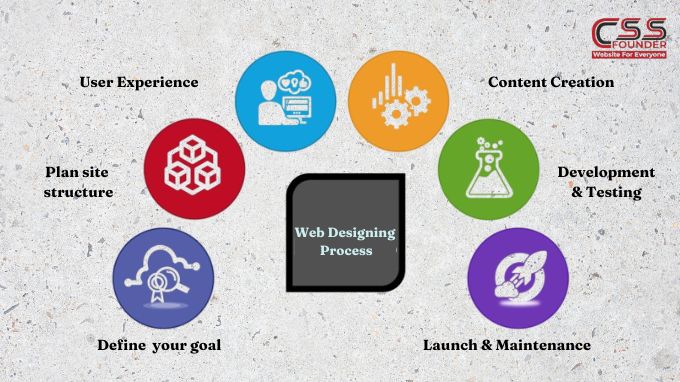
Elevate Your Brand With Expert Website Designing Process Building a website is a multi-faceted process that requires careful planning, creative vision, and technical expertise. Whether you’re creating a simple brochure site or a complex e-commerce platform, following a structured website design process can help ensure a successful outcome. In this article, we’ll walk through how to elevate your brand with expert website designing process Define Your Goals and Target Audience Before you begin the design phase, it’s crucial to have a clear understanding of your website’s objectives and the audience you’re trying to reach. Are you building an online portfolio, an e-commerce store, or an informational resource? Identifying your goals will shape the website’s structure, content, and overall user experience. Additionally, researching your target audience’s demographics, interests, and online behaviors will help you tailor the design and content to their preferences, making your website more engaging and effective. Plan Your Site Structure and Navigation Once you’ve defined your goals and target audience, it’s time to plan your site’s structure and navigation. This step involves creating a sitemap, which outlines the hierarchy of pages and how they’re interconnected. A well-organized sitemap ensures that visitors can easily find the information they’re looking for and navigate through your website without getting lost or frustrated. Design the User Experience (UX) User experience (UX) design is the process of creating a seamless, intuitive, and enjoyable experience for your website visitors. This involves several factors, including: Information Architecture: Organizing and structuring content in a logical and easy-to-understand way. User Interface (UI) Design: Creating visually appealing layouts, choosing color schemes, typography, and imagery that align with your brand identity. Usability: Ensuring that your website is easy to use, with intuitive navigation, clear calls-to-action, and responsive design for various devices. During the UX design phase, it’s essential to create wireframes and prototypes to visualize the website’s layout and functionality before diving into the visual design. Visual Design and Branding Once the UX design is finalized, it’s time to bring your website to life with visual design and branding elements. This step involves: Color Scheme: Choosing a color palette that reflects your brand personality and enhances the overall aesthetic appeal. Typography: Selecting fonts that are legible, consistent with your brand, and complementary to the design. Imagery and Graphics: Incorporating high-quality images, illustrations, icons, and other visual elements that support your content and brand messaging. Branding Elements: Integrating your logo, brand guidelines, and other visual assets to create a cohesive and recognizable brand experience. Content Creation and Optimization Content is the backbone of any website, and creating compelling, relevant, and optimized content is crucial for engaging your audience and achieving your goals. This step involves: Copywriting: Crafting clear, concise, and persuasive text that resonates with your target audience and supports your website’s objectives. Search Engine Optimization (SEO): Optimizing your content and website structure for better visibility and higher rankings in search engine results. Multimedia Integration: Incorporating videos, infographics, and other multimedia elements to enhance the user experience and convey information more effectively. Development and Testing With the design and content in place, it’s time to bring your website to life through coding and development. This stage involves: Front-end Development: Translating the visual design into HTML, CSS, and JavaScript to create the user interface. Back-end Development: Building the server-side functionality, integrating databases, and implementing features like e-commerce, forms, and user accounts. Testing and Quality Assurance: Thoroughly testing the website across different browsers, devices, and scenarios to identify and fix any bugs or issues before launch. Launch and Maintenance After rigorous testing and quality assurance, your website is finally ready for launch. However, the process doesn’t end there. Ongoing maintenance and optimization are essential to ensure your website remains relevant, secure, and up-to-date. This includes: Monitoring and Analytics: Tracking website performance, user behavior, and traffic sources to identify areas for improvement. Security and Updates: Implementing regular software updates and security patches to protect your website from vulnerabilities and cyber threats. Continuous Improvement: Regularly reviewing and enhancing your website based on user feedback, analytics data, and evolving trends and technologies. By following this comprehensive website design process, you can create a visually stunning, user-friendly, and effective online presence that meets your goals and exceeds your audience’s expectations.
How Much Can You Earn As a Website Designer in India?

In the ever-evolving digital landscape, website design has emerged as a crucial aspect of any business’s online presence. A well-designed website can not only attract and engage customers but also serve as a powerful marketing and branding tool. As a result, the demand for skilled website designers in India has been steadily increasing, making it an attractive career path for those with a passion for design and technology. In this blog we shall discuss about one of the most common questions that arise for aspiring website designers is “ How much can you earn as a website designer in India?” Factors Influencing Website Designer Salaries in India The salary of a website designer in India can vary significantly depending on several factors. Understanding these factors is crucial for setting realistic expectations and negotiating fair compensation. Some key factors are : Experience Level: As with most professions, experience plays a pivotal role in determining a website designer’s earning potential. Entry-level designers with little to no professional experience can expect lower salaries compared to their more seasoned counterparts who have honed their skills over the years. Educational Qualifications: While a formal degree in website design or a related field is not always a prerequisite, having a relevant educational background can enhance a designer’s marketability and earning potential. Degrees or certifications in fields such as graphic design, user experience (UX) design, or computer science can be advantageous. Skill Set: Website design encompasses a diverse range of skills, including proficiency in design software (e.g., Adobe Creative Suite, Sketch, Figma), coding languages (HTML, CSS, JavaScript), user experience principles, and an understanding of responsive design and accessibility standards. Designers with a broader and more advanced skill set are typically able to command higher salaries. Location: India is a vast country with significant regional differences in cost of living and industry demand. Generally, website designers working in metro cities like Mumbai, Delhi, Bangalore, and Hyderabad tend to earn higher salaries compared to those in smaller cities or rural areas. Industry and Company Size: The industry and size of the company can also impact a website designer’s salary. Large corporations, well-established companies, and agencies often offer higher pay packages compared to smaller businesses or startups with limited budgets. Average Salaries for Website Designers in India According to data from various job portals and industry reports, the average salary for a website designer in India can range from ₹2,50,000 to ₹10,00,000 per annum. Here’s a breakdown of typical salaries based on experience level: Entry-Level (0-2 years of experience): ₹2,50,000 – ₹4,00,000 per annum Mid-Level (3-5 years of experience): ₹4,00,000 – ₹6,00,000 per annum Experienced (6-10 years of experience): ₹6,00,000 – ₹8,00,000 per annum Senior or Lead Designer (10+ years of experience): ₹8,00,000 – ₹10,00,000 per annum It’s important to note that these figures are approximate and can vary significantly depending on the specific factors mentioned earlier, such as location, industry, and company size. Freelance vs. Full-Time Employment In addition to traditional full-time employment, many website designers in India also opt for freelance work. Freelancing can offer greater flexibility, the ability to work with multiple clients, and the potential for higher earnings, but it also comes with a lack of job security and benefits. Freelance website designers in India typically charge between ₹20,000 to ₹50,000 per project, depending on the scope and complexity of the work. Increasing Earning Potential For website designers in India looking to increase their earning potential, several strategies can be employed: Continuous Learning: Staying up-to-date with the latest design trends, technologies, and best practices is crucial in an ever-evolving industry like website design. Pursuing additional certifications, attending workshops or conferences, and engaging in self-study can help designers stay competitive and command higher salaries. Specialization: Developing expertise in a particular niche or industry can make a designer more valuable and in-demand. For example, specializing in e-commerce website design, health care website design, or user experience (UX) design can open up opportunities for higher-paying projects or positions. Freelancing or Consulting: Offering freelance or consulting services in addition to full-time employment can provide an additional income stream and diverse project experience. Building a Portfolio: A strong portfolio showcasing diverse and innovative website designs is essential for attracting higher-paying clients or job opportunities. Regularly updating and curating a portfolio can demonstrate a designer’s skills and versatility.


