
The Latest Web Design Trends in 2024
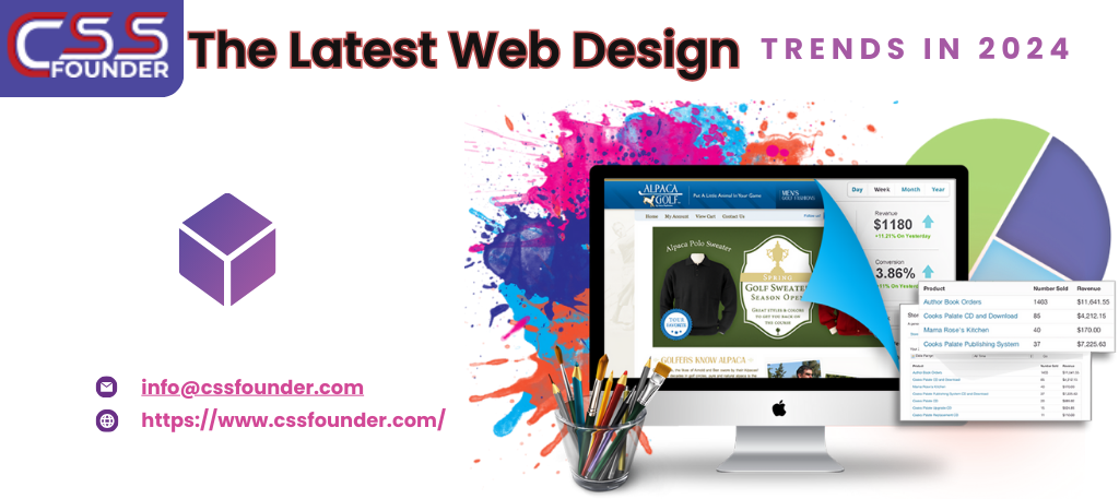
In the rapidly evolving world of web design, staying current with the latest trends is crucial for creating engaging, user-friendly, and aesthetically pleasing websites. As we move through 2024, several design trends are shaping the digital landscape. These trends not only enhance the visual appeal of websites but also improve usability and accessibility. Let’s dive into some of the most prominent web design trends of this year, which are essential for any web design company aiming to stay ahead of the curve.. 1. Minimalist Design Minimalist design continues to dominate the web design space in 2024. Characterised by simplicity and functionality, minimalism focuses on using fewer elements to create a clean, uncluttered look. This approach not only enhances the visual appeal but also improves the user experience by reducing distractions and making navigation straightforward. Key features of minimalist design include: Ample White Space: Generous use of white space helps to highlight content and create a balanced layout. Simple Colour Palettes: Minimalist designs often use a limited colour palette, typically neutral tones, to maintain a clean look. Clean Typography: Simple, sans-serif fonts are preferred for their readability and modern appearance. Essential Elements Only: Only necessary elements are included, ensuring that every component has a clear purpose. 2. Dark Mode Dark mode has become a staple in modern web design, offering an alternative to traditional light interfaces. This trend gained popularity due to its aesthetic appeal and practical benefits, such as reducing eye strain in low-light environments and saving battery life on OLED screens. Key characteristics of dark mode include: Dark Backgrounds: Typically, dark mode uses black or dark gray backgrounds with lighter text. High Contrast: Ensuring text and other elements stand out against the dark background is crucial for readability. Vibrant Accents: Bright accent colours can be used to highlight important buttons and links, creating a striking visual contrast. User Preference: Many websites now offer a toggle switch, allowing users to choose between dark and light modes based on their preference. 3. Responsive Design With the increasing variety of devices used to access the web, responsive design remains essential. A responsive design ensures that websites look and function well on all screen sizes, from smartphones to desktops. Key aspects of responsive design include: Fluid Grids: Using a grid system that scales based on the screen size ensures that the layout adapts seamlessly. Flexible Images: Images and media adjust their size and resolution based on the device, ensuring fast loading times and optimal display. Media Queries: CSS media queries are used to apply different styles depending on the device characteristics, such as screen width and orientation. Mobile-First Approach: Designing for mobile devices first and then scaling up for larger screens ensures a better user experience across all devices. 4. 3D Elements and Illustrations 3D elements and illustrations are becoming increasingly popular in web design. They add depth and realism to websites, making them more engaging and interactive. Advances in technology have made it easier to incorporate 3D graphics without compromising loading times or performance. Key features of 3D elements and illustrations include: Interactive 3D Models: Allowing users to interact with 3D objects can enhance engagement and provide a unique user experience. Detailed Illustrations: High-quality 3D illustrations can make a website stand out and convey complex ideas more effectively. Augmented Reality (AR) Integration: Some websites are starting to integrate AR to provide immersive experiences, particularly in e-commerce and product showcases. 5. Micro-Interactions Micro-interactions are small animations or design elements that provide feedback to users. They play a crucial role in enhancing the user experience by making interactions feel more intuitive and responsive. Examples of micro-interactions include: Hover Effects: Changing the appearance of buttons or links when hovered over. Loading Animations: Providing visual feedback while content is loading. Interactive Form Fields: Highlighting form fields or showing validation messages in real-time. Notification Badges: Indicating new messages or updates with subtle animations. 6. Voice User Interface (VUI) With the rise of smart speakers and voice assistants, voice user interfaces (VUI) are becoming an important aspect of web design. Incorporating voice search and commands can enhance accessibility and provide a hands-free browsing experience. Key aspects of VUI include: Voice Search Optimization: Ensuring that websites are optimized for voice search queries. Voice Commands: Allowing users to navigate the website or perform actions using voice commands. Audio Feedback: Providing auditory feedback to confirm actions or notify users. 7. Customizable User Experiences Personalization is key in 2024, with more websites offering customizable user experiences. This trend involves tailoring content and features to individual users based on their preferences, behavior, and demographics. Key features of customizable user experiences include: User Profiles: Allowing users to create profiles and save their preferences. Dynamic Content: Displaying content that adapts to the user’s interests and past interactions. AI and Machine Learning: Using AI to predict user needs and personalize the experience in real-time. Localization: Adapting content and design based on the user’s geographic location. 8. Bold Typography Bold typography is making a statement in web design, with designers using large, attention-grabbing fonts to create a strong visual impact. This trend is particularly effective for headlines and calls to action, making it easier to convey important messages. Key features of bold typography include: Oversized Fonts: Using larger-than-usual fonts for headlines and key text elements. Contrasting Text: Ensuring that bold text contrasts sharply with the background for readability. Unique Fonts: Choosing distinctive fonts that reflect the brand’s personality and stand out visually. Minimal Text: Pairing bold typography with minimal text to keep the design clean and focused. 9. Immersive Storytelling Immersive storytelling is a trend that combines visual design, interactive elements, and compelling narratives to create engaging user experiences. This approach is particularly effective for brands looking to build emotional connections with their audience. Key features of immersive storytelling include: Visual Narratives: Using images, videos, and animations to tell a story. Interactive Elements: Incorporating elements like scroll-triggered animations and clickable hotspots to engage users. Sequential Content: Presenting content in a logical, story-like sequence that guides users
Unlock the Power of Digital Presence: 10 Perks of Having a Business Website
In the era of digital transformation, having a strong online presence is no longer a luxury but an imperative for businesses of all sizes and industries. A well-designed, user-friendly website acts as a virtual storefront, a marketing powerhouse, and a hub for customer engagement. Here are ten compelling reasons why you need a business website to reach your customers. Global Reach and 24/7 Accessibility With a website, your business can transcend geographical boundaries and reach a global audience around the clock. Unlike a physical storefront, your online presence is accessible to potential customers from anywhere in the world, at any time of day or night. This increased visibility and accessibility open up new markets and opportunities for growth. Cost-Effective Marketing and Advertising Traditional marketing methods, such as print ads and direct mail campaigns, can be costly and have a limited reach. A well-optimized website, on the other hand, provides a cost-effective way to market your business on a global scale. By leveraging search engine optimization (SEO) and online advertising platforms, you can target your desired audience with precision and measurable results. Credibility and Professional Image In today’s digital age, consumers often judge a business’s credibility and professionalism based on its online presence. A well-designed, informative website conveys a sense of legitimacy and trustworthiness, setting your business apart from competitors who lack an online presence or have an outdated website. Showcase Products and Services A website serves as a dynamic, multimedia showcase for your products and services. With high-quality images, videos, virtual tours, and detailed descriptions, you can provide potential customers with a comprehensive understanding of your offerings, enhancing their decision-making process and increasing the likelihood of making a sale. Improved Customer Service and Support By incorporating features such as online ordering, frequently asked questions (FAQs), knowledge bases, and contact forms, a website can streamline customer service and support. Customers can easily find the information they need, place orders, or submit inquiries, reducing the burden on your staff and improving overall efficiency. Gather Valuable Customer Data and Insights A website can be a goldmine of customer data and analytics, providing insights into visitor behavior, preferences, and demographics. This information can inform your marketing strategies, product development, and overall business decisions, giving you a competitive edge in understanding and catering to your target audience. Establish an Online Community Through features like blogs, social media integration, and customer forums, a website can foster an online community around your brand. This community can serve as a powerful marketing tool, as satisfied customers share their experiences and recommendations with others, building brand loyalty and attracting new customers. Enable E-commerce and Expand Revenue Streams For businesses that sell physical products or services, a website can open up new revenue streams by enabling e-commerce capabilities. Online sales can complement your brick-and-mortar operations, reaching a wider audience and providing customers with the convenience of shopping from anywhere, at any time. Enhance Brand Awareness and Recognition A well-designed, visually appealing website can be a powerful branding tool, helping to establish and reinforce your brand’s identity, values, and unique selling proposition. By consistently presenting your brand across all digital touchpoints, you can increase brand awareness and recognition, fostering customer loyalty and trust. Stay Competitive in the Digital Landscape In today’s fast-paced and tech-driven business environment, having a website is no longer an option but a necessity for staying competitive. As more and more consumers turn to the internet for their shopping, research, and decision-making needs, businesses without an online presence risk falling behind their digitally-savvy competitors. Investing in a professional, user-friendly website is an invaluable step towards enhancing your business’s visibility, credibility, and overall success in the digital age. By embracing the power of the internet, you can unlock new opportunities for growth, streamline operations, and provide a superior customer experience that sets you apart from the competition. In an increasingly connected world, a well-crafted website is the foundation upon which your digital presence is built, and the key to unlocking a world of possibilities for your business.
Ecommerce Website Development Costs in India: What You Need to Know Before Getting Started

In the digital age, having an online presence is crucial for businesses to reach and engage with customers effectively. One of the most popular ways to establish an online presence is through an eCommerce website, which allows companies to sell their products or services directly to consumers over the internet. In India, the eCommerce market has witnessed explosive growth in recent years, with more and more businesses recognizing the importance of having an online store. However, developing an eCommerce website can be a significant investment, and the cost can vary greatly depending on various factors. In this article, we’ll explore the key elements that influence the Ecommerce Website Development Costs in India and provide you with a general idea of what you can expect to pay. Type of eCommerce Website: The type of eCommerce website you require will play a major role in determining the overall cost of development. Basically, there are three major types of eCommerce websites: Simple eCommerce Website: These websites typically offer a limited range of products or services and have basic functionalities like product listings, shopping carts, and checkout processes. The cost of developing a simple eCommerce website in India can range from ₹50,000 to ₹1,50,000. Medium eCommerce Website: These websites offer a wider range of products or services and include additional features such as product filtering, user reviews, and advanced search capabilities. The cost of developing a medium eCommerce website in India can range from ₹1,50,000 to ₹5,00,000. Complex eCommerce Website: These websites are tailored for large businesses with extensive product catalogs, multiple payment gateways, advanced shipping and logistics integrations, and custom functionalities. The cost of developing a complex eCommerce website in India can range from ₹5,00,000 to ₹20,00,000 or even higher, depending on the specific requirements. Design and User Experience: The design and user experience (UX) of an eCommerce website are critical factors that can impact its success. A well-designed and user-friendly website can enhance customer engagement, improve conversion rates, and ultimately drive more sales. The cost of design and UX can vary depending on the complexity of the website and the level of customization required. On average, expect to pay between ₹50,000 and ₹2,00,000 for design and UX services in India. Integrations and Third-Party Services: Most eCommerce websites require integrations with various third-party services such as payment gateways, shipping providers, and inventory management systems. These integrations can add to the overall development cost, depending on the number and complexity of the services being integrated. The cost of integrations can range from ₹20,000 to ₹2,00,000 or more, depending on the requirements. Hosting and Maintenance: Once your eCommerce website is developed, you’ll need to host it on a reliable server and ensure regular maintenance and updates. The cost of hosting can vary depending on the hosting provider, the type of hosting plan, and the amount of traffic your website receives. In India, hosting costs typically range from ₹500 to ₹10,000 per month. Additionally, you’ll need to factor in the cost of ongoing maintenance and updates, which can range from ₹10,000 to ₹50,000 per year or more, depending on the complexity of your website. Developer Expertise and Location: The cost of eCommerce website development can also be influenced by the expertise and location of the development team. Hiring experienced developers from reputable agencies or firms in metropolitan cities like Mumbai, Bangalore, or Delhi can be more expensive than hiring freelance developers or teams from smaller cities or towns. The cost of developers in India can range from ₹20,000 to ₹1,00,000 per month or more, depending on their expertise and experience. It’s important to note that these cost estimates are general and can vary significantly based on your specific requirements, the complexity of your project, and the development team you choose to work with. It’s always recommended to consult with multiple eCommerce development agencies or freelancers to get accurate quotes and compare their services, experience, and pricing before making a decision. In conclusion, the cost of eCommerce website development in India can range from a few thousand rupees for a simple website to several lakhs or even crores for a complex, feature-rich online store. By carefully evaluating your requirements, prioritizing essential features, and working with experienced developers, you can create a cost-effective and successful eCommerce platform that meets your business needs and drives growth in the competitive Indian market.
Elevate Your Brand With Expert Website Designing Process
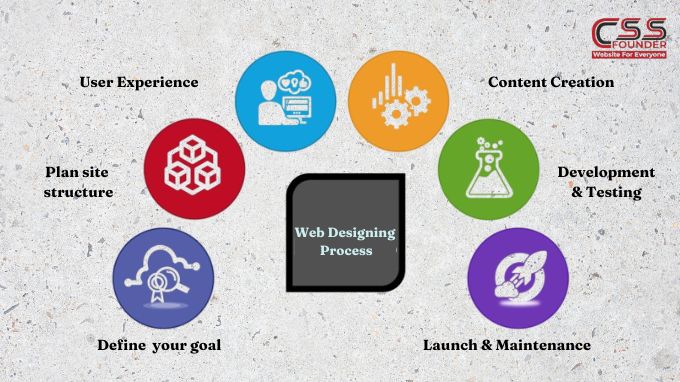
Elevate Your Brand With Expert Website Designing Process Building a website is a multi-faceted process that requires careful planning, creative vision, and technical expertise. Whether you’re creating a simple brochure site or a complex e-commerce platform, following a structured website design process can help ensure a successful outcome. In this article, we’ll walk through how to elevate your brand with expert website designing process Define Your Goals and Target Audience Before you begin the design phase, it’s crucial to have a clear understanding of your website’s objectives and the audience you’re trying to reach. Are you building an online portfolio, an e-commerce store, or an informational resource? Identifying your goals will shape the website’s structure, content, and overall user experience. Additionally, researching your target audience’s demographics, interests, and online behaviors will help you tailor the design and content to their preferences, making your website more engaging and effective. Plan Your Site Structure and Navigation Once you’ve defined your goals and target audience, it’s time to plan your site’s structure and navigation. This step involves creating a sitemap, which outlines the hierarchy of pages and how they’re interconnected. A well-organized sitemap ensures that visitors can easily find the information they’re looking for and navigate through your website without getting lost or frustrated. Design the User Experience (UX) User experience (UX) design is the process of creating a seamless, intuitive, and enjoyable experience for your website visitors. This involves several factors, including: Information Architecture: Organizing and structuring content in a logical and easy-to-understand way. User Interface (UI) Design: Creating visually appealing layouts, choosing color schemes, typography, and imagery that align with your brand identity. Usability: Ensuring that your website is easy to use, with intuitive navigation, clear calls-to-action, and responsive design for various devices. During the UX design phase, it’s essential to create wireframes and prototypes to visualize the website’s layout and functionality before diving into the visual design. Visual Design and Branding Once the UX design is finalized, it’s time to bring your website to life with visual design and branding elements. This step involves: Color Scheme: Choosing a color palette that reflects your brand personality and enhances the overall aesthetic appeal. Typography: Selecting fonts that are legible, consistent with your brand, and complementary to the design. Imagery and Graphics: Incorporating high-quality images, illustrations, icons, and other visual elements that support your content and brand messaging. Branding Elements: Integrating your logo, brand guidelines, and other visual assets to create a cohesive and recognizable brand experience. Content Creation and Optimization Content is the backbone of any website, and creating compelling, relevant, and optimized content is crucial for engaging your audience and achieving your goals. This step involves: Copywriting: Crafting clear, concise, and persuasive text that resonates with your target audience and supports your website’s objectives. Search Engine Optimization (SEO): Optimizing your content and website structure for better visibility and higher rankings in search engine results. Multimedia Integration: Incorporating videos, infographics, and other multimedia elements to enhance the user experience and convey information more effectively. Development and Testing With the design and content in place, it’s time to bring your website to life through coding and development. This stage involves: Front-end Development: Translating the visual design into HTML, CSS, and JavaScript to create the user interface. Back-end Development: Building the server-side functionality, integrating databases, and implementing features like e-commerce, forms, and user accounts. Testing and Quality Assurance: Thoroughly testing the website across different browsers, devices, and scenarios to identify and fix any bugs or issues before launch. Launch and Maintenance After rigorous testing and quality assurance, your website is finally ready for launch. However, the process doesn’t end there. Ongoing maintenance and optimization are essential to ensure your website remains relevant, secure, and up-to-date. This includes: Monitoring and Analytics: Tracking website performance, user behavior, and traffic sources to identify areas for improvement. Security and Updates: Implementing regular software updates and security patches to protect your website from vulnerabilities and cyber threats. Continuous Improvement: Regularly reviewing and enhancing your website based on user feedback, analytics data, and evolving trends and technologies. By following this comprehensive website design process, you can create a visually stunning, user-friendly, and effective online presence that meets your goals and exceeds your audience’s expectations.
How Much Can You Earn As a Website Designer in India?
In the ever-evolving digital landscape, website design has emerged as a crucial aspect of any business’s online presence. A well-designed website can not only attract and engage customers but also serve as a powerful marketing and branding tool. As a result, the demand for skilled website designers in India has been steadily increasing, making it an attractive career path for those with a passion for design and technology. In this blog we shall discuss about one of the most common questions that arise for aspiring website designers is “ How much can you earn as a website designer in India?” Factors Influencing Website Designer Salaries in India The salary of a website designer in India can vary significantly depending on several factors. Understanding these factors is crucial for setting realistic expectations and negotiating fair compensation. Some key factors are : Experience Level: As with most professions, experience plays a pivotal role in determining a website designer’s earning potential. Entry-level designers with little to no professional experience can expect lower salaries compared to their more seasoned counterparts who have honed their skills over the years. Educational Qualifications: While a formal degree in website design or a related field is not always a prerequisite, having a relevant educational background can enhance a designer’s marketability and earning potential. Degrees or certifications in fields such as graphic design, user experience (UX) design, or computer science can be advantageous. Skill Set: Website design encompasses a diverse range of skills, including proficiency in design software (e.g., Adobe Creative Suite, Sketch, Figma), coding languages (HTML, CSS, JavaScript), user experience principles, and an understanding of responsive design and accessibility standards. Designers with a broader and more advanced skill set are typically able to command higher salaries. Location: India is a vast country with significant regional differences in cost of living and industry demand. Generally, website designers working in metro cities like Mumbai, Delhi, Bangalore, and Hyderabad tend to earn higher salaries compared to those in smaller cities or rural areas. Industry and Company Size: The industry and size of the company can also impact a website designer’s salary. Large corporations, well-established companies, and agencies often offer higher pay packages compared to smaller businesses or startups with limited budgets. Average Salaries for Website Designers in India According to data from various job portals and industry reports, the average salary for a website designer in India can range from ₹2,50,000 to ₹10,00,000 per annum. Here’s a breakdown of typical salaries based on experience level: Entry-Level (0-2 years of experience): ₹2,50,000 – ₹4,00,000 per annum Mid-Level (3-5 years of experience): ₹4,00,000 – ₹6,00,000 per annum Experienced (6-10 years of experience): ₹6,00,000 – ₹8,00,000 per annum Senior or Lead Designer (10+ years of experience): ₹8,00,000 – ₹10,00,000 per annum It’s important to note that these figures are approximate and can vary significantly depending on the specific factors mentioned earlier, such as location, industry, and company size. Freelance vs. Full-Time Employment In addition to traditional full-time employment, many website designers in India also opt for freelance work. Freelancing can offer greater flexibility, the ability to work with multiple clients, and the potential for higher earnings, but it also comes with a lack of job security and benefits. Freelance website designers in India typically charge between ₹20,000 to ₹50,000 per project, depending on the scope and complexity of the work. Increasing Earning Potential For website designers in India looking to increase their earning potential, several strategies can be employed: Continuous Learning: Staying up-to-date with the latest design trends, technologies, and best practices is crucial in an ever-evolving industry like website design. Pursuing additional certifications, attending workshops or conferences, and engaging in self-study can help designers stay competitive and command higher salaries. Specialization: Developing expertise in a particular niche or industry can make a designer more valuable and in-demand. For example, specializing in e-commerce website design, health care website design, or user experience (UX) design can open up opportunities for higher-paying projects or positions. Freelancing or Consulting: Offering freelance or consulting services in addition to full-time employment can provide an additional income stream and diverse project experience. Building a Portfolio: A strong portfolio showcasing diverse and innovative website designs is essential for attracting higher-paying clients or job opportunities. Regularly updating and curating a portfolio can demonstrate a designer’s skills and versatility.
Elevate your website design with custom illustrations in 2024.
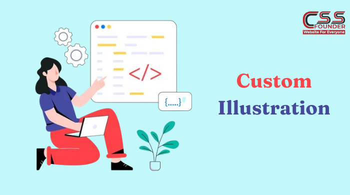
In the ever-evolving landscape of web design, businesses are constantly seeking ways to captivate their online audience and create a lasting impression. While traditional design elements like stock photography and generic graphics have long been staple choices, an emerging trend is the use of custom illustrations. These unique, hand-drawn or digitally rendered visuals offer a fresh and creative approach that can elevate a website’s visual appeal, strengthen brand identity, and enhance the overall user experience. In this article, we shall explore how to elevate your website design with custom illustrations. Enhancing Brand Identity and Differentiation Custom illustrations are a powerful tool for establishing and reinforcing a brand’s unique identity. Unlike stock images or generic graphics, which can be found on countless websites, custom illustrations are tailored to a brand’s specific visual language, tone, and personality. By incorporating these custom visuals throughout a website, businesses can create a cohesive and distinctive brand experience that sets them apart from competitors in a crowded digital marketplace. Communicating Complex Concepts with Simplicity Web design often requires the communication of complex ideas, products, or services in a clear and concise manner. Custom illustrations excel at simplifying intricate concepts through thoughtful visual metaphors and creative representations. By breaking down complex information into easy-to-understand visuals, custom illustrations can help visitors grasp ideas quickly and efficiently, enhancing the overall user experience and increasing engagement. Evoking Emotional Connections Well-crafted custom illustrations have the power to evoke emotional responses from viewers. By incorporating elements of storytelling, humor, or whimsy, these visuals can create a more personal and engaging experience for website visitors. This emotional connection can foster stronger brand loyalty, encourage users to spend more time exploring and interacting with the website, and ultimately drive conversions or desired actions. Versatility and Scalability Custom illustrations offer a high degree of versatility and scalability in web design. Unlike static images, these visuals can be easily adapted and resized to suit different screen sizes and device resolutions, ensuring a consistent and visually appealing experience across desktop, tablet, and mobile platforms. Additionally, custom illustrations can be repurposed across various marketing materials, such as social media graphics, email campaigns, or print collateral, providing a cohesive brand experience across multiple touchpoints. Cost-Effectiveness and Ownership While the initial investment in custom illustrations may be higher than purchasing stock images, the long-term benefits can outweigh the costs. Custom illustrations become a valuable asset that businesses own and can use indefinitely without the need for additional licensing fees or usage restrictions. Furthermore, the ability to reuse and repurpose these visuals across multiple platforms and marketing efforts can provide significant cost savings over time. Creativity and Innovation Custom illustrations encourage creativity and innovation in web design. By working closely with talented illustrators or designers, businesses can explore unique visual styles and narratives that align with their brand’s personality and values. This collaborative process can lead to fresh and original designs that capture the attention of visitors and leave a lasting impression. Additionally, custom illustrations can be updated and refreshed over time, allowing businesses to keep their website visuals fresh and engaging. Accessibility and Inclusivity Custom illustrations can be designed with accessibility and inclusivity in mind, ensuring that website content is presented in a way that is welcoming and understandable to all users, regardless of their abilities or backgrounds. By incorporating diverse and representative visuals, businesses can create a more inclusive online experience and demonstrate their commitment to diversity and accessibility. Seamless Integration with Web Design Trends Custom illustrations can seamlessly integrate with modern web design trends, such as minimalism, flat design, and responsive design. These visuals can complement and enhance these styles, creating a harmonious and visually appealing experience for users. Additionally, custom illustrations can be designed to align with emerging trends, ensuring that a website stays current and visually engaging. Increased Engagement and Conversion Rates By creating a visually striking and engaging online presence with custom illustrations, businesses can improve user engagement and increase conversion rates. Well-designed custom visuals can captivate visitors, encourage them to explore the website further, and ultimately guide them towards desired actions, such as making a purchase or signing up for a service. In conclusion, the use of custom illustrations in web design offers numerous benefits that can elevate a website’s visual appeal, strengthen brand identity, enhance user experience, and drive conversions. From enhancing brand differentiation and communicating complex concepts with simplicity to evoking emotional connections and encouraging creativity, custom illustrations are a powerful tool for businesses seeking to create a memorable and engaging online presence. By embracing this trend and investing in high-quality custom visuals, businesses can stand out in a crowded digital landscape and create a lasting impression on their audience.
10 Mistakes to avoid for a Perfect Responsive Web Design in 2024

In today’s mobile-centric world, responsive web design has become a critical aspect of creating a seamless and user-friendly online experience across various devices and screen sizes. As technology continues to evolve, the expectations of users and the demands of the digital landscape also change. To stay ahead of the curve, web designers and developers must stay vigilant and avoid common pitfalls that can compromise the effectiveness of their responsive designs. In this blog we shall discuss about 10 Mistakes to avoid for a Perfect Responsive Web Design. Neglecting Performance Optimization With the increasing prevalence of mobile devices and the demand for faster load times, performance optimization is more crucial than ever. Failing to optimize your website’s code, images, and other assets for efficient delivery can result in frustratingly slow load times, especially on mobile devices with limited bandwidth or processing power which further leads to increase in bounce rate factor. Overlooking Accessibility Creating an accessible website should be a top priority for any web designer. In 2024, neglecting accessibility guidelines and best practices can not only alienate users with disabilities but also put your website at risk of legal repercussions. Ensure that your responsive design incorporates features like proper alt text, keyboard navigation, and color contrast ratios to cater to users with diverse abilities. Ignoring Mobile Usability While responsive design aims to provide a consistent experience across devices, it’s essential to recognize the unique challenges and constraints of mobile environments. Failing to optimize for mobile usability, such as implementing touch-friendly navigation, minimizing pinch-and-zoom requirements, and streamlining content for smaller screens, can lead to a frustrating and inefficient user experience on mobile devices. Compromising Readability Responsive web design should prioritize readability, ensuring that content is easily consumable on various screen sizes. Avoid common mistakes like using excessively small font sizes, inadequate line spacing, or poor contrast ratios, which can strain users’ eyes and hinder content comprehension, especially on smaller screens. Neglecting Responsive Images and Media In an increasingly visual world, responsive images and media are crucial for providing an optimal user experience. Failing to implement responsive techniques for images, videos, and other media can result in distorted or improperly scaled content, negatively impacting the overall design and user experience. Overlooking Cross-Browser Compatibility With the ever-evolving landscape of web browsers and their varying rendering capabilities, ensuring cross-browser compatibility is essential. Neglecting to test your responsive design across different browsers and versions can lead to layout issues, broken functionality, or inconsistent experiences for some users. Ignoring User Context Responsive web design should consider the user’s context, such as their location, device capabilities, and environmental factors. Failing to account for these variables can result in suboptimal experiences, such as presenting content or features that are irrelevant or inaccessible to the user’s specific situation. Sacrificing Consistency While responsive design necessitates adapting the layout and presentation of content across devices, it’s crucial to maintain a consistent look, feel, and overall brand identity. Failing to do so can create a disjointed and confusing experience for users, undermining your brand’s credibility and recognition. Overlooking Mobile Input Methods Mobile devices often rely on touch-based input methods, such as tapping, swiping, and pinching. Failing to optimize user interfaces and interactions for these input methods can lead to frustration and hinder the overall usability of your responsive design on mobile devices. Neglecting Maintenance and Updates Responsive web design is an ongoing process that requires regular maintenance and updates to keep up with evolving technologies, design trends, and user expectations. Failing to regularly review and update your responsive design can lead to compatibility issues, outdated aesthetics, and a subpar user experience over time. By avoiding these common mistakes, web designers and developers can create responsive websites that provide a seamless and engaging experience across various devices and screen sizes. Embracing best practices, staying up-to-date with industry trends, and continuously optimizing for performance, accessibility, and usability will be paramount in delivering exceptional responsive web design in 2024 and beyond.
How AI revolutionizing Web design and Impact on User experience in 2024

In the ever-changing digital world of technology, the integration of artificial intelligence (AI) into web design processes is revolutionizing the way websites are conceived, developed, and experienced. From enhancing user experiences to streamlining design workflows, AI is proving to be a game-changer, pushing the boundaries of what’s possible in the world of web design. In this blog , we shall discuss about how AI revolutionizing web design and impact on user experience. AI-Driven Design Optimization One of the most significant impacts of AI in web design lies in its ability to optimize user experiences. By leveraging machine learning algorithms and data analysis, AI can identify patterns in user behavior, preferences, and interactions. This valuable insight enables web designers to create interfaces that are tailored to the specific needs and expectations of their target audience. For instance, AI-powered tools can analyze user journeys, heatmaps, and click patterns, providing designers with actionable data to refine navigation structures, content hierarchy, and visual layouts. This data-driven approach ensures that websites are intuitive, engaging, and responsive, ultimately enhancing user satisfaction and conversion rates. Automated Design Generation AI is also transforming the way web designers approach the creative process. With the advent of generative design algorithms, AI can now assist in generating visual elements, layouts, and even entire website mockups. These AI-powered tools leverage machine learning techniques to analyze design trends, color palettes, typography styles, and other visual elements, producing a vast array of design options tailored to specific project requirements. This automated design generation not only saves time and effort but also opens up new avenues for creativity and exploration. Designers can quickly iterate through multiple design concepts, experimenting with different styles and aesthetics, while ensuring adherence to branding guidelines and best practices. Personalized Experiences with AI AI is also enabling web designers to create highly personalized experiences for users. By leveraging machine learning algorithms and user data, websites can dynamically adapt their content, layout, and functionality to match individual preferences and behaviors. For example, an e-commerce website could use AI to analyze a user’s browsing history, purchase patterns, and demographic data to recommend products or tailor the website’s layout and navigation accordingly. Due to considerable increase in personalization engagement and conversion ratio is much likely to boost Intelligent Content Creation and Optimization AI is revolutionizing the way content is created and optimized for the web. Natural Language Processing (NLP) and Natural Language Generation (NLG) technologies enable AI systems to analyze and generate human-readable text, making it possible to automatically create website copy, blog posts, product descriptions, and even entire pages. Additionally, AI-powered tools can analyze existing content, suggesting improvements for readability, search engine optimization (SEO), and overall effectiveness. This not only saves time and effort for content creators but also ensures that website content is engaging, relevant, and optimized for search engines. Accessibility and Inclusive Design with AI Accessibility and inclusive design have become paramount in web development, ensuring that websites are usable and enjoyable for individuals with diverse abilities and needs. AI is playing a crucial role in this area by automating accessibility testing, identifying potential barriers, and suggesting improvements. AI-powered tools can analyze websites for compliance with accessibility standards, such as Web Content Accessibility Guidelines (WCAG), and provide recommendations for enhancing contrast ratios, implementing proper alt text for images, and optimizing content structure for screen readers and assistive technologies. The Future of Web Design with AI As AI continues to evolve, its impact on web design will only become more profound. Advancements in areas such as computer vision, natural language processing, and generative adversarial networks (GANs) will unlock new possibilities for creating immersive and interactive web experiences and also boosts user experience. For instance, AI-powered virtual assistants could guide users through complex website interfaces, providing personalized support and recommendations. Additionally, AI-generated 3D models and animations could revolutionize the way products and services are presented online, offering users a highly engaging and realistic experience. However, as AI becomes more integrated into web design processes, it is crucial to address ethical considerations, such as privacy, bias, and transparency. Web designers and developers must ensure that AI systems are trained on diverse and unbiased data sets, and that their decision-making processes are transparent and accountable. Conclusion The impact of AI in web design is profound, transforming the way websites are conceived, developed, and experienced. From optimizing user experiences to automating design processes and enhancing accessibility, AI is revolutionizing the digital landscape. As this technology continues to advance, web designers and developers must embrace its potential while navigating its challenges and ethical considerations. By doing so, they can unlock new realms of creativity, efficiency, and user satisfaction, driving the evolution of the web into an ever-more engaging and inclusive space.
CMS vs Frameworks: Which One is Best for Web Development in 2024?
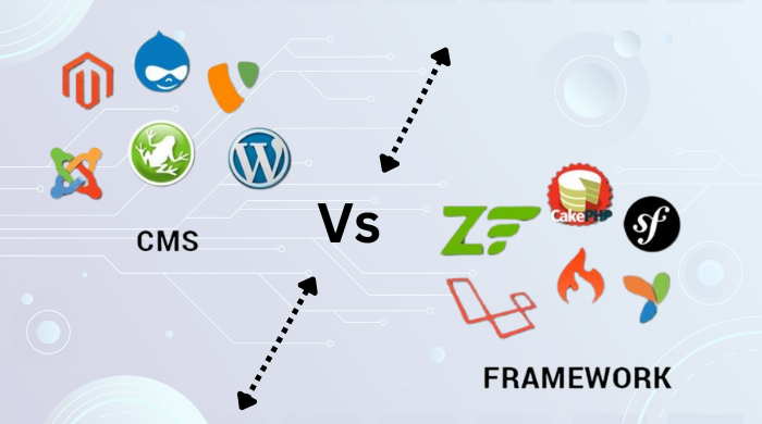
In the ever-evolving world of web development, two prominent approaches have gained significant traction: Content Management Systems (CMS) and Frameworks. While both serve the purpose of building websites and web applications, they differ in their core functionalities, underlying architectures, and suitability for various project requirements. In this article, we’ll explore the strengths and limitations of CMS Vs Framework approach, helping you determine which one aligns best with your web development goals. Content Management Systems (CMS) A Content Management System (CMS) is a software application designed to simplify the creation, management, and modification of digital content. CMSs are primarily used for building websites and blogs, enabling users with varying technical expertise to create, edit, and publish content without delving into the intricacies of coding. Popular examples of CMSs include WordPress, Joomla, Drupal, and Magento (for e-commerce). These platforms offer user-friendly interfaces, pre-built templates, and a vast ecosystem of plugins and extensions that extend their functionality. Advantages of Using a CMS: Ease of Use: CMSs provide a user-friendly interface, making it easier for non-technical users to manage website content. Content-Focused: CMSs are designed specifically for content management, making them ideal for websites and blogs that prioritize content creation and delivery. Extensibility: Many CMSs offer a wide range of plugins and extensions that can enhance functionality, from e-commerce capabilities to social media integration. Rapid Development: With pre-built templates and tools, CMSs enable faster website development compared to building from scratch. Limitations of CMSs: Limited Customization: While CMSs offer plugins and themes, extensive customization may require substantial coding or compromises in design and functionality. Performance Issues: As CMSs become more feature-rich, their performance can degrade, especially for large or complex websites. Security Concerns: Popular CMSs can be targets for hackers, requiring regular updates and security patches. Frameworks A web development framework is a collection of pre-written code, libraries, and tools that provide a structured environment for building web applications. Frameworks offer a solid foundation and a set of conventions that developers can leverage to streamline the development process. Popular examples of web development frameworks include React, Angular, Vue.js (for front-end development), Django, Ruby on Rails, and Laravel (for back-end development). Advantages of Using Frameworks: Increased Productivity: Frameworks provide a solid foundation and a set of conventions, reducing the need to reinvent the wheel and allowing developers to focus on building application-specific features. Scalability and Performance: Many frameworks are designed with scalability and performance in mind, enabling the development of large-scale, high-performance applications. Community Support: Popular frameworks often have active communities that contribute to their development, provide documentation, and offer support. Consistency and Maintainability: Frameworks promote consistent coding practices and architectural patterns, making it easier to maintain and scale applications over time. Limitations of Frameworks: Steep Learning Curve: Frameworks often require a significant learning curve, especially for developers new to the framework’s conventions and patterns. Vendor Lock-in: Adopting a specific framework can lead to vendor lock-in, making it difficult to switch to alternative solutions in the future. Potential Overhead: Frameworks can introduce overhead in terms of file size and performance, especially if not optimized or used efficiently. Limited Flexibility: While frameworks provide structure and conventions, they may also impose constraints on how applications are built, potentially limiting flexibility in certain scenarios. Choosing Between CMS and Frameworks The preference among a CMS and a framework in the end relies upon at the unique necessities of your concern project. Choose a CMS if: Your primary focus is on content creation and management (e.g., blogs, news websites, corporate websites). You need a user-friendly interface for non-technical users to manage content. You require a quick setup and deployment process. Your project has limited customization requirements or can be achieved through available plugins or extensions. Choose a Framework if: You’re building a complex web application with advanced functionality and custom features. Performance and scalability are critical requirements for your project. You have a team of experienced developers familiar with the framework’s conventions and patterns. Your project requires a high degree of customization and flexibility. You prioritize long-term maintainability and scalability over rapid initial development. It’s important to note that the decision between a CMS and a framework is not always an either-or scenario. In some cases, a hybrid approach can be adopted, where a CMS is used for content management, while a framework is integrated for building custom features or handling complex application logic. Ultimately, the choice between a CMS and a framework should be driven by a thorough understanding of your project requirements, available resources, and the specific strengths and limitations of each approach. By carefully evaluating your needs and aligning them with the appropriate solution, you can ensure a successful and efficient web development process.
Elevate Your Website Design with Parallax Scrolling in 2024
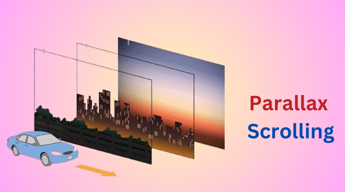
In the world of web design, creating a compelling and engaging user experience is crucial. With the ever-evolving landscape of technology, designers are constantly seeking innovative techniques to captivate their audience. One such technique that has gained significant traction in recent years is parallax scrolling. This visual effect, when implemented effectively, can enhance a website’s design and provide users with an immersive and memorable browsing experience. In this article, we shall discuss about how to elevate your website design with parallax scrolling. What is Parallax Scrolling? Parallax scrolling is a web design technique that creates a multi-layered scrolling effect, where background elements move at a different speed than foreground elements, creating a sense of depth and perspective. This effect mimics the way our eyes perceive objects at different distances in the real world, resulting in a more natural and visually appealing experience. Enhancing User Engagement One of the primary benefits of parallax scrolling is its ability to enhance user engagement. By introducing a sense of depth and movement, websites become more dynamic and interactive, capturing the user’s attention and encouraging them to explore further. This technique can be particularly effective for storytelling or highlighting key features, as it allows designers to guide the user’s focus and create a narrative flow. Creating Depth and Dimensionality Parallax scrolling adds an extra dimension to an otherwise flat website design. By utilizing multiple layers that move at varying speeds, designers can create a sense of depth and perspective, making the website feel more three-dimensional and immersive. This effect can be particularly powerful when combined with high-quality visuals, such as stunning photography or detailed illustrations, further enhancing the overall aesthetic appeal. Providing a Smooth Scrolling Experience One of the key advantages of parallax scrolling is its ability to provide a smooth and seamless scrolling experience. As users scroll through the content, the layered elements move in harmony, creating a fluid and visually pleasing transition. This smooth scrolling experience can contribute to a more enjoyable and engaging user journey, encouraging users to explore the website further. Highlighting Content and Storytelling Parallax scrolling can be an effective tool for highlighting specific content or conveying a narrative. By strategically placing elements on different layers and controlling their movement, designers can guide the user’s focus and create a storytelling experience. This technique is particularly useful for showcasing products, services, or brand stories in a visually compelling manner. Building Brand Identity and Memorability In today’s competitive digital landscape, standing out is crucial for businesses and brands. Parallax scrolling can help create a unique and memorable user experience that sets a website apart from its competitors. By incorporating this visually striking effect, brands can leave a lasting impression on their audience, contributing to brand recognition and recall. Responsive and Mobile-Friendly While parallax scrolling was initially designed for desktop experiences, modern web development techniques have made it possible to implement this effect seamlessly on mobile devices as well. With the rise of mobile usage, it’s essential for websites to be responsive and provide a consistent experience across various devices. Parallax scrolling, when implemented correctly, can enhance the mobile browsing experience and create a cohesive design across all platforms. However, it’s important to note that parallax scrolling should be used judiciously and in moderation. Overuse or improper implementation can lead to performance issues, slow load times, and a frustrating user experience. Designers should strike a balance between visual appeal and practicality, ensuring that the implementation of parallax scrolling enhances the overall user experience without compromising usability or accessibility. In conclusion, parallax scrolling is a powerful web design technique that offers numerous benefits, from enhancing user engagement and creating depth and dimensionality to providing a smooth scrolling experience and highlighting content in a visually compelling manner. When used effectively, it can help build brand identity, create memorable experiences, and set a website apart from competitors. As the web design landscape continues to evolve, techniques like parallax scrolling will play an increasingly important role in captivating and engaging audiences.


